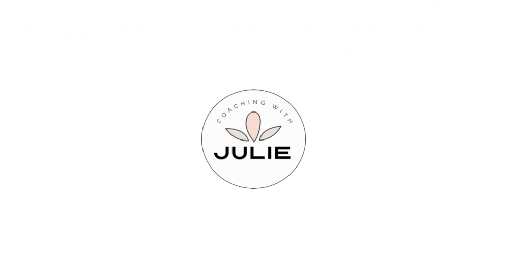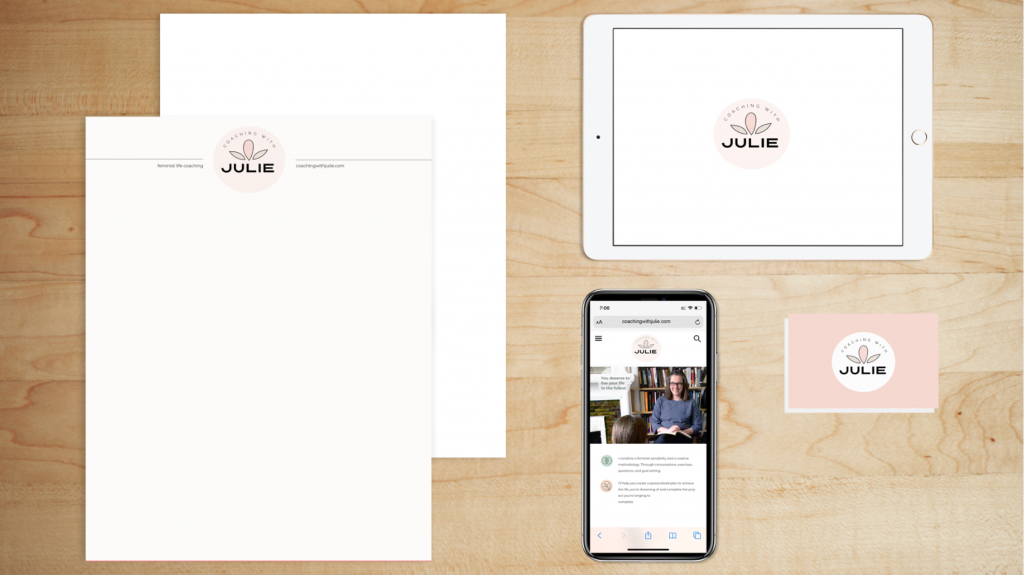
The new logo design used modern, sans serif fonts with a contemporary look that works beautifully in colour or black and white.
The primary colour was inspired by Julie’s vision for a rose colour. The overall brand palette is modern and feminine with neutral tones. Taupe and green as secondary. Colours add to the colour story while creating a sense of warmth. These versatile and timeless colours can be used across web and print nicely.
Fonts should be used to create contrast. There is a variety of styles and weights that can help balance words throughout any branded communication materials.


